소개
이번 WWDC25에서 새로운 컨셉의 Liquid Glass 디자인이 발표되었지만, 저는 아무래도 나이가 들어서인지 새로운 디자인이 잘 눈에 들어오지 않고 좋은 디자인이 아닌것 같다고 느꼈습니다. 여러 곳의 반응을 보니, 이렇게 생각하는건 저뿐만은 아니었던것 같습니다. 이번 새로운 디자인 컨셉에 대한 비판글이 여럿 있었고, 그 중 공유해도 좋을 것 같은 글을 가져왔습니다.
저는 아래의 모든 내용에 동의하지는 않습니다. 당장 제가 가져온 비판글에 대한 비판 반응도 제법 많았습니다. 하지만 전체적인 틀에서 ‘UI/UX 측면에서 개선되어야 한다’라는 큰 틀에서는 대체로 동의하는 편이므로 글을 공유해봅니다.
Apple의 Liquid Glass 디자인 베타에 대한 피드백
I am a graphics programmer, and here’s my feedback on Apple’s Liquid Glass beta.
저는 그래픽 프로그래머이며, Apple의 Liquid Glass 베타에 대한 피드백을 공유합니다.
The idea is cool, but it’s difficult to work with from a UX perspective.
아이디어는 멋지지만 UX 관점에서는 다루기 어렵습니다.
Let’s start with the main problems:
주요 문제점부터 살펴보겠습니다.
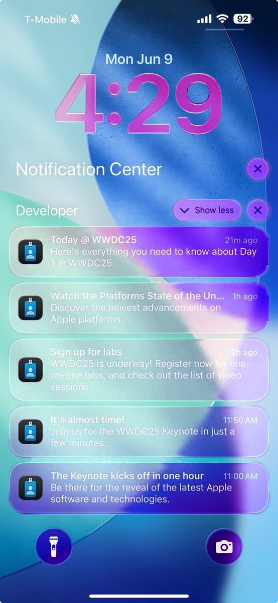
1 – Low Contrast: It’s clearly not readable, but there are many different ways to fix it.
1 – 낮은 명도 대비: 명백히 읽기 어렵지만, 이를 해결할 수 있는 다양한 방법이 있습니다.
2 – Borders: The shapes of buttons and UI are unclear.
2 – 테두리: 버튼과 UI의 형태가 불분명합니다.
They just blend into their surroundings with a very subtle rim, which isn’t very apparent at a distance
미세한 테두리로 주변과 섞여 멀리서 보면 잘 구분되지 않습니다.
3 – Weak Blur: The blur is just too weak to distinguish the UI elements from the background.
3 – 약한 블러: 블러가 너무 약해 UI 요소와 배경을 구분하기 어렵습니다.
This is much more noticeable on text or high-contrast backgrounds
텍스트나 고대비 배경에서 특히 더 두드러집니다.
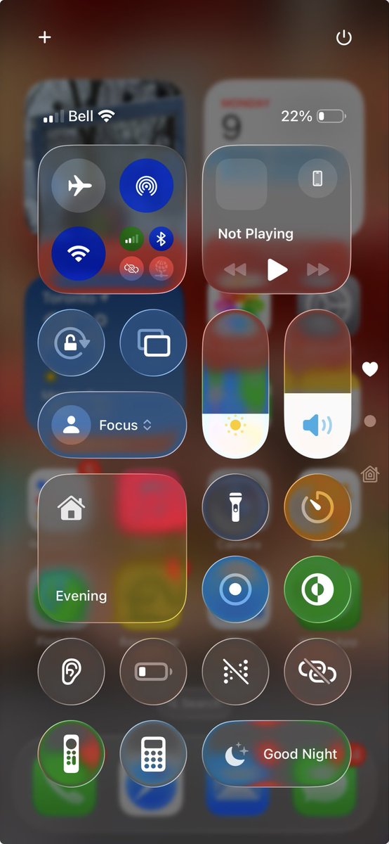
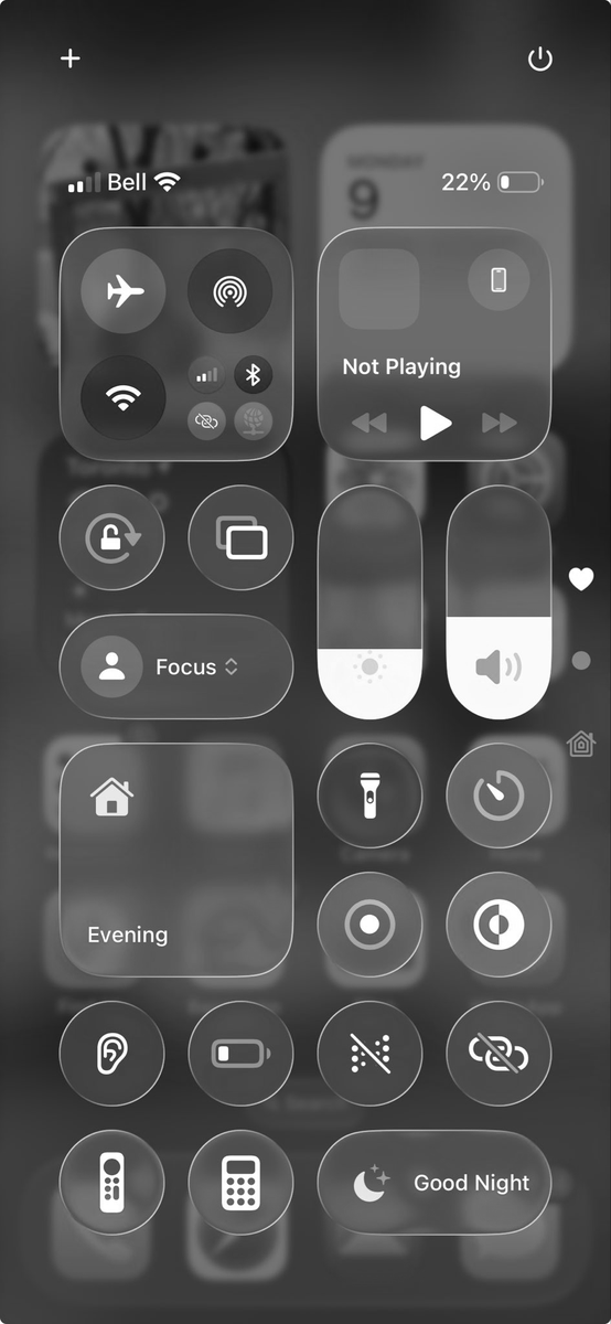
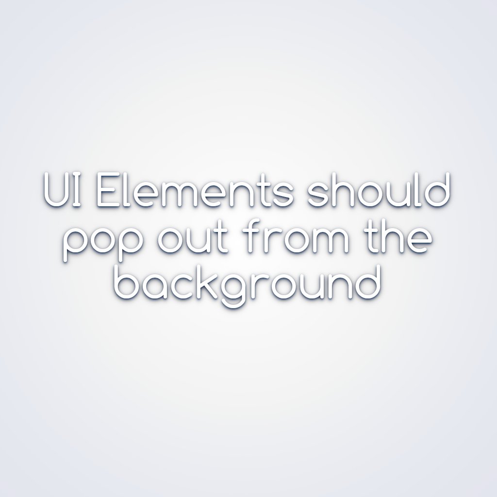
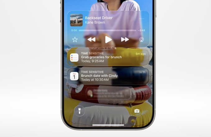
4 – Separation: Look what happens when you put the glassy UI on top of the homescreen.
4 – 분리감 부족: 유리 같은 UI를 홈 화면 위에 놓으면 어떻게 되는지 보십시오.
The foreground elements should stand apart from the background, but since they are clear, they don’t pop out at all.
전경 요소는 배경과 구분되어야 하지만, 투명해서 전혀 눈에 띄지 않습니다.
It’s easy to see the issue in luminance.
휘도 측면에서 문제를 쉽게 확인할 수 있습니다.
5 – Composition: Some backgrounds do not suit the clear UI well at all.
5 – 구성: 어떤 배경은 투명 UI와 전혀 어울리지 않습니다.
This is not an issue with opaque/semi-transparent UI, but clear distinguish itself from soft backgrounds
불투명하거나 반투명한 UI에서는 문제가 되지 않지만, 투명 UI는 부드러운 배경과 구분되지 않습니다.

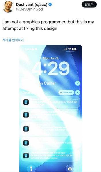
Now there are lots of different ways to address these issues, but here’s what I would do:
이러한 문제들을 해결하는 방법은 다양하지만, 제가 제안하는 방법은 다음과 같습니다.
1 – Drop Shading: I don’t mean a cheap Gaussian blur with a pixel offset.
1 – 그림자 음영: 단순한 픽셀 오프셋의 가우시안 블러를 말하는 것이 아닙니다.
It should be a stack blur at multiple scales for a nice blend.
다단계 스택 블러로 부드럽게 섞이도록 해야 합니다.
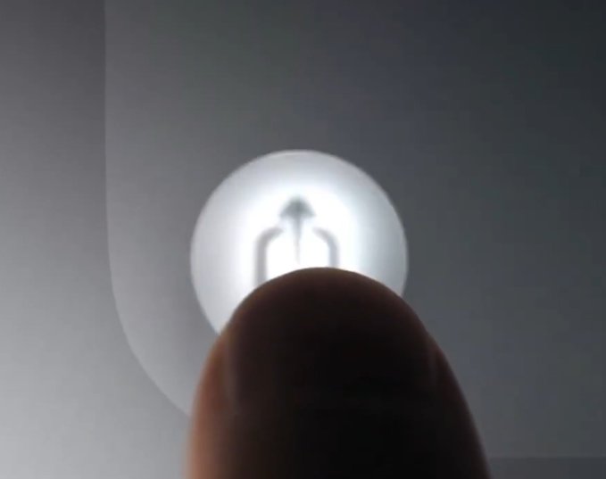
Here’s the worst-case scenario, white-on-white:
최악의 상황인 흰 배경 위의 흰 UI입니다:
For added character, there should be a sprinkle of sky color (more color in the finer blurs).
더 풍부한 느낌을 위해 블러에 하늘색을 살짝 섞는 것이 좋습니다 (더 미세한 블러일수록 더 많은 색상 포함).
It should feel like natural lighting.
자연광처럼 느껴져야 합니다.
The shadow offset could respond to the gyro similarly to the specular highlights, improving the sense of depth and response
그림자 오프셋은 자이로에 따라 반응하게 하여 반사광처럼 깊이감과 반응성을 향상시킬 수 있습니다.
2 – Rim Lighting: To improve the separation from the foreground, the UI should have stronger rim lighting with a smoother falloff.
2 – 테두리 광원: 전경과의 구분을 위해 UI에 더 강한 테두리 조명을 적용하고, 점진적으로 사라지게 해야 합니다.
Combine this with a subtle drop shadow, and it should stand out from any background
은은한 그림자와 함께 사용하면 어떤 배경에서도 눈에 띄게 됩니다.
3 – Blur Tweaks: The blur looks too flat and uniform.
3 – 블러 조정: 현재 블러는 너무 평면적이고 균일해 보입니다.
It should use a progressive blur with stronger blurring at the edges.
가장자리는 더 강하게 처리되는 점진적 블러를 적용해야 합니다.
When the background is out of focus, it should use a disc blur for a richer bokeh effect
배경이 초점에서 벗어났을 때는 디스크 블러로 더 풍부한 보케 효과를 줄 수 있습니다.

4 – Caustics: Glass UI elements should glow on the side opposite the light.
4 – 카우스틱(*빛이 특정 물체를 통과하거나 반사하면서 만들어지는 집중된 빛의 패턴) 효과: 유리 UI는 빛 반대쪽에서 은은한 빛을 내야 합니다.
This would improve the sense of separation and make it feel more glassy and lively.
이렇게 하면 분리감이 생기고, 더 유리 같고 생동감 있는 느낌을 줄 수 있습니다.
The specular highlights could be intensified a little
반사광은 조금 더 강조할 수 있습니다.

5 – Tonemap. In some of the demos, it appears to be overexposed.
5 – 톤 매핑: 일부 데모에서는 과다 노출된 것처럼 보입니다.
It should be tonemapped (if it’s not already) for soft glowing without harsh boundaries.
이미 톤 매핑이 되어 있지 않다면, 부드러운 발광과 부자연스러운 경계를 없애기 위해 톤 매핑이 필요합니다.
6 – Stained Glass. Another interesting concept is colored glass.
6 – 스테인드 글라스: 또 다른 흥미로운 아이디어는 색이 들어간 유리입니다.
This gives more room for customization and helps with visual separation.
이 방법은 커스터마이징의 여지를 넓히고 시각적 구분을 도와줍니다.
For better results, it should be a gradient
더 나은 효과를 위해서는 그라디언트를 사용하는 것이 좋습니다.
Here’s a quick and dirty concept:
다음은 빠르게 만든 개념 이미지입니다:
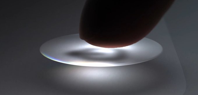
참고 1) 완벽한 해결책
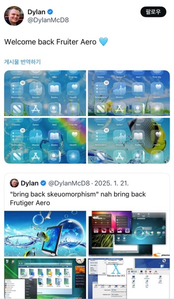
참고 2) Frutiger Aero??
프루티거 에어로 컨셉과 관련된 반응도 있습니다. 어차피 유리 컨셉으로 갈거면 이렇게 접근하는 것도 꽤 괜찮아보입니다. 🏝️🌴


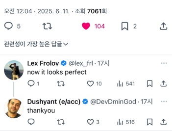
0개의 댓글